
Trip X
Whether it’s a weekend road trip, or an international trip to an exotic country, taking a trip with friends/family should be a fun and exciting event. However, managing the expenses of a group trip can be confusing, overwhelming, and cause frustration.
Client
Trip X
*Note: This was a conceptual project born from personal experiences of frustration when managing expenses of group trips.
My Role
Sole product designer
Duration
80 hours
Scope
Research, UI/UX design, brand design, prototyping, user testing
Managing Group trip expenses
The Problem
Tracking, splitting, and reimbursements of group trip expenses can be unorganized, overwhelming, and confusing.
The solution
A collaborative expense tracking app, made specifically for group trips that provides transparency and efficiency in facilitating expense tracking, splitting, and reimbursements.
Research
The Goal
We want to know what different variables and situations affect how costs are managed, incurred, and settled, so that we can understand the pain points of the task.
The Methodologies
Competitive analysis to see if there are services that offer a way to ‘split the bill’ / manage expenses of group trips
Interviews to do in depth research on pain points, needs, and how users manage the costs of a group trip
Competitive Analysis

Wanderlog
Trip planner with itineraries, travel organizing, collaboration, budgeting, and splitting
Strengths
Focus on trip planning and organizing
Collaboration made easy
Many trip planning features to keep most planning in app
Weaknesses
Too many entry fields for information make it complicated to complete a task
Large learning curve with using the app

Splitwise
Expense tracking, splitting, organizing, and settling app
Strengths
Focus on expense sharing, tracking, splitting and settling
App is straightforward
Complex expense splitting made easy
Weaknesses
Solely bill splitting focus
Expenses are listed as they are entered into app.Large learning curve with using the app

Mobili
Group trip planner with expense tracking and in app messenger
Strengths
Prioritizes itinerary and enables view/share with group
Expense organizing and tracking
Trip details on a timeline
Weaknesses
Sign up/ Log in page does not seem to be working
Has too many features that causes confusion
Expense tracking seems vague

Splid
Expense app focused on splitting and settling in as few transactions as possible
Strengths
Focus on splitting and settling expenses
Join/access without creating account
Easy sharing and settling expenses
Weaknesses
Unclear difference between categories
Inputting expense details is confusing
Confusing to split if amount is not equal
Competitive Analysis Key Findings
Travel planning + expense tracking: Mixing the two requires a large learning curve.
Complex splitting: We can adapt splitting options to fit our user’s needs
Inputting expense: Should be simple and easy to do on-the-go. Categories should be clear and concise.
Features all companies had: Collaborating with friends, working on/offline, and having a currency converter
Interviews
5 interviews conducted
Age: 30-40
Travel with a group: 1+ per year

Interview Key Findings
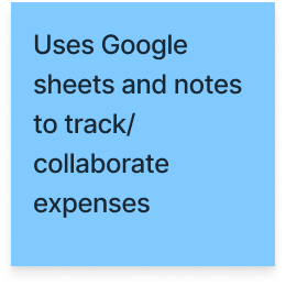
5/5 participants track their expenses using a combination of methods; keeping receipts, taking notes, saving emails, and using apps like Splitwise, Google Sheets, and Venmo
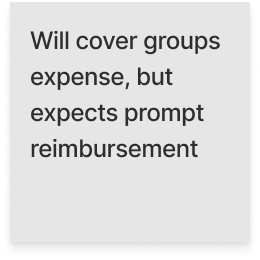
4/5 participants expressed that getting reimbursed was a pain point
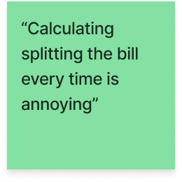
4/5 participants commented that splitting the bill is complex, and requires trust and transparency
Meet Mike

Mike is a new husband in his mid 30’s, who’s been recently promoted. He has a close-knit group of friends and they take weekend trips at least 3 times a year and travel internationally once a year. As his friends start families, it’s now necessary to plan itineraries that include both group and family time. He's the one everyone looks to when it comes to planning and organizing expenses to make sure everyone gets fairly reimbursed.
Needs
Transparency
Track expenses in a collaborative way
Timely reimbursement
“I’m the one handling the expenses”
Motivations
Avoid emotional and financial strains
“It’s my money and I want my money back”
Challenges
Tracking during trip can be difficult
Doesn’t always recall who was part of the expense
Goals
General idea of expenses
Track expenses in an organized and transparent way
Fair reimbursement
Digital Wireframes

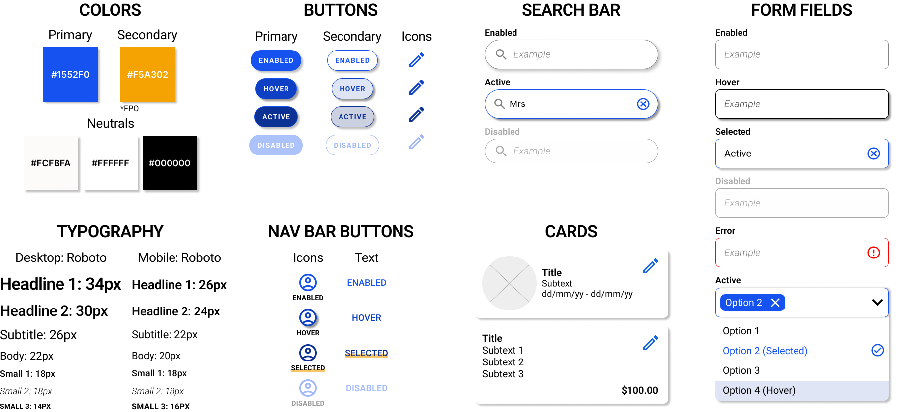
UI Components
Prototype + Test


Usability test Key Findings
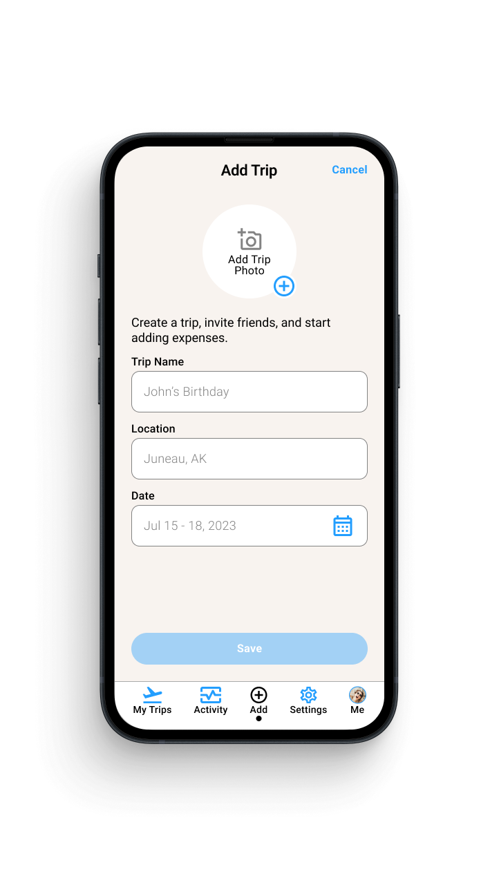
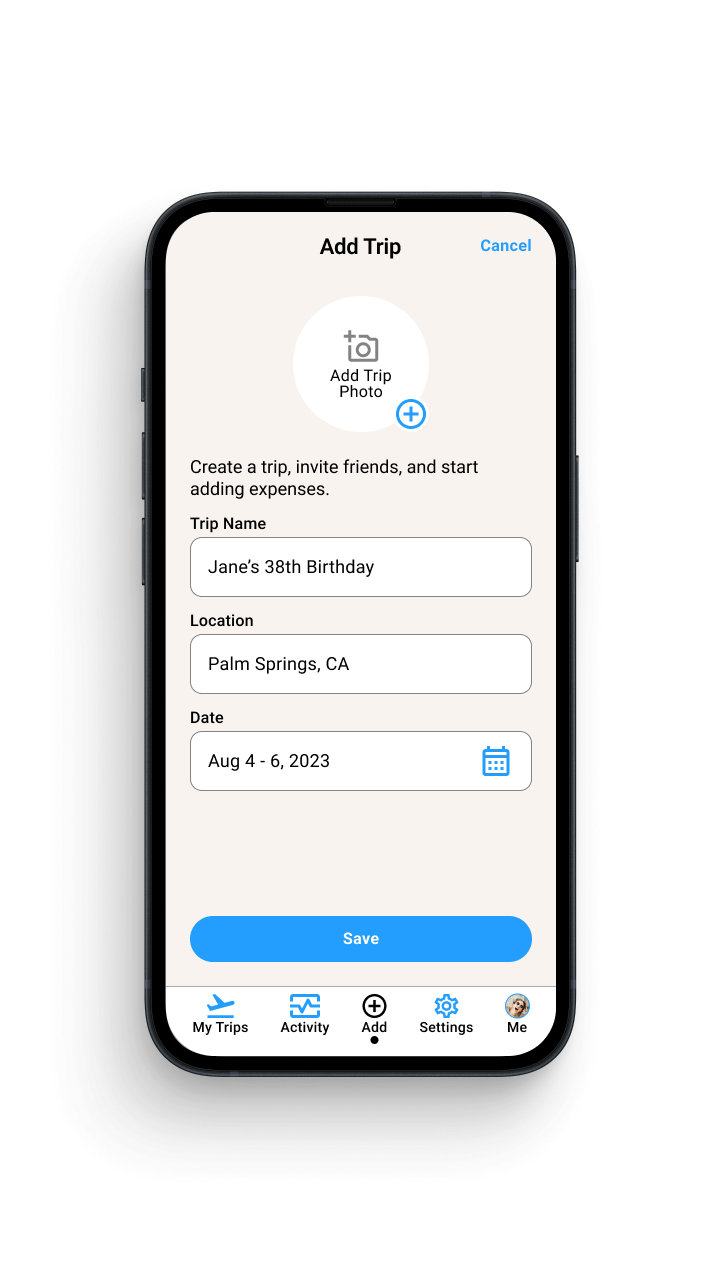
Creating a Trip
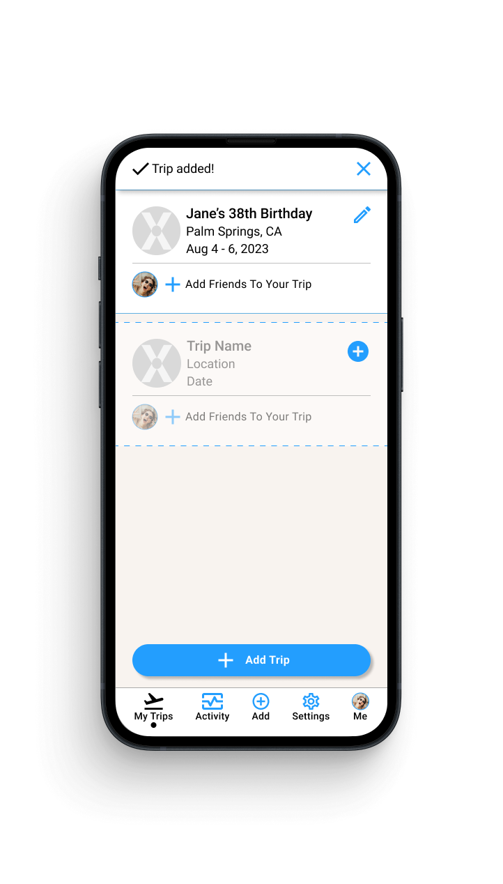
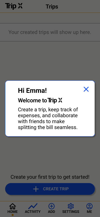
3/5 participants were confused on the homepage.
4/5 participants wanted to see the created trip after success modal
3/5 participants felt the color palette was cold/corporate
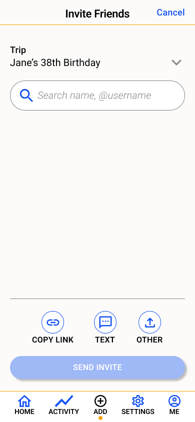
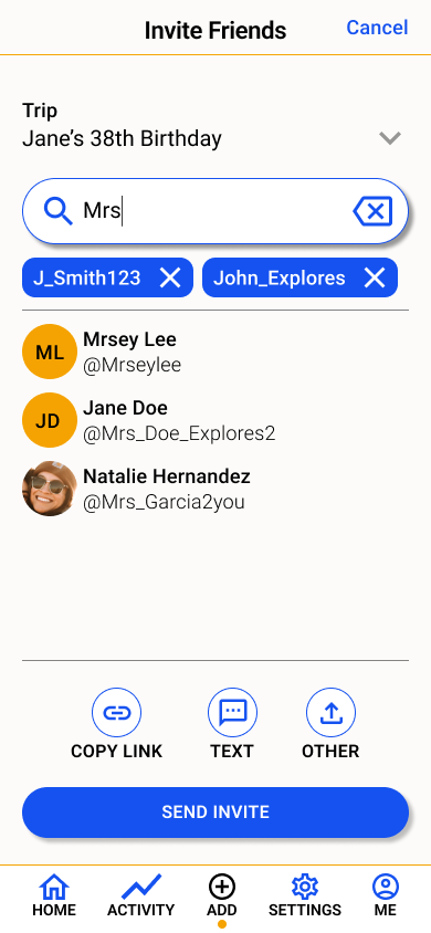
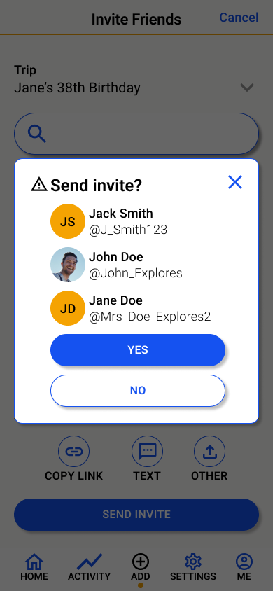
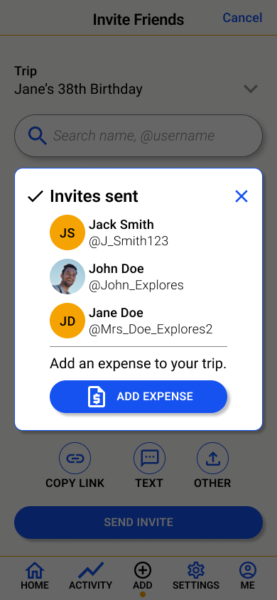
Inviting Friends to a trip
3/5 participants were confused by some of the language
3/5 participants felt the modals were burdensome
4/5 participants would primarily text to invite friends to the trip
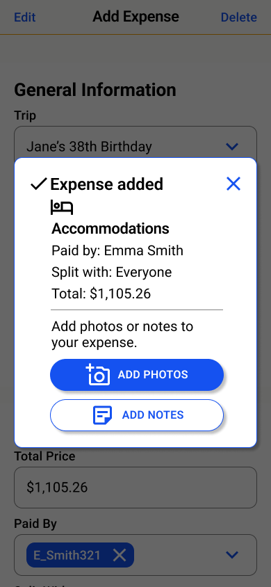
Adding An expense
3/5 participants want to see their own personal totals easily
3/5 participants wanted more complex splitting options
4/5 participants felt negatively about the success modal
Revisions
Overall Platform Iterations
Color palette: Adjusted color palette to feel more friendly and fun since users felt it was too “corporate” and “cold” for a platform that was meant for travel.
Language: Adjusted language of pages and tasks to be more specific and consistent throughout.
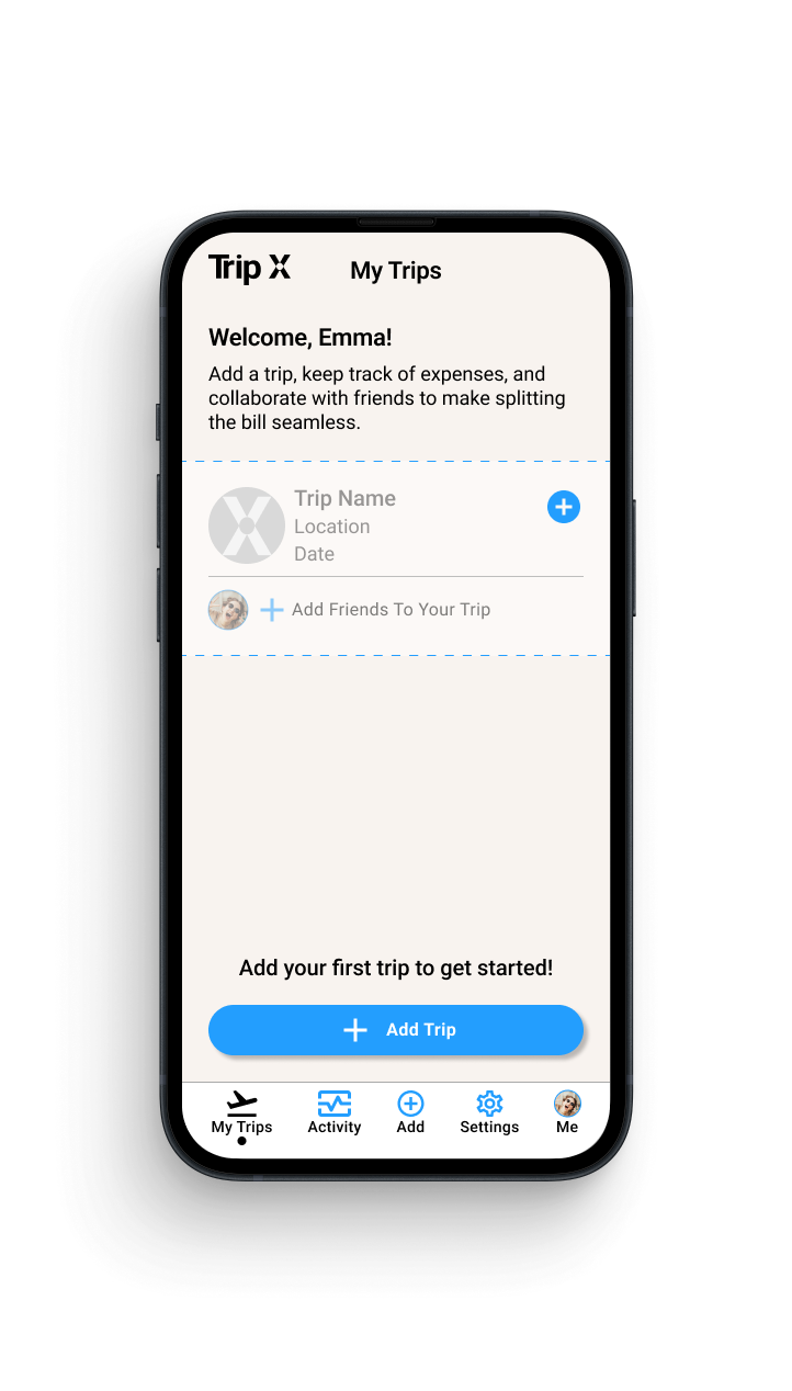
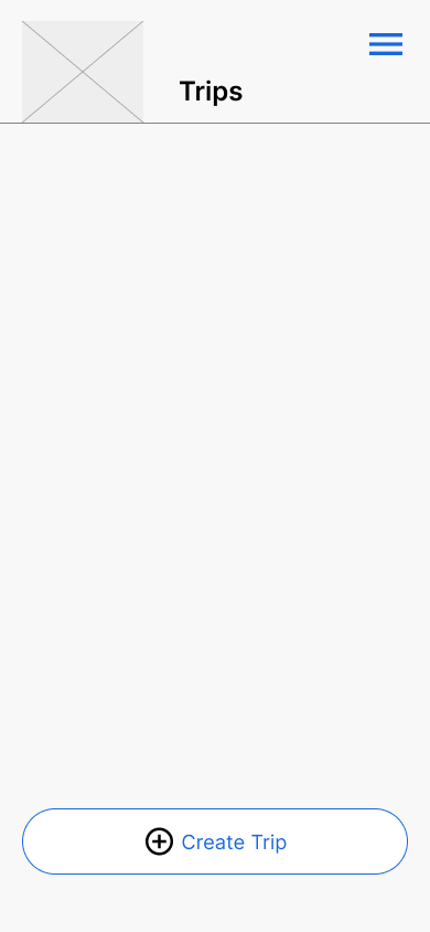
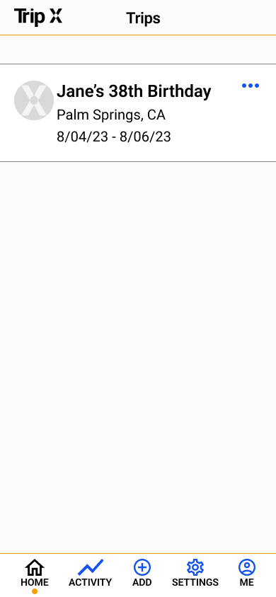
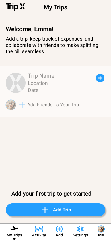
‘My Trips’ Homepage
Welcome modal: Got rid of modal and put it on page since users weren’t actually reading modal but still wanted/expected to see some sort of intro to Trip X on the homepage.
Trip card: Added empty trip card to show users what it would look like so users know what to expect since they were confused and lost on the homepage.
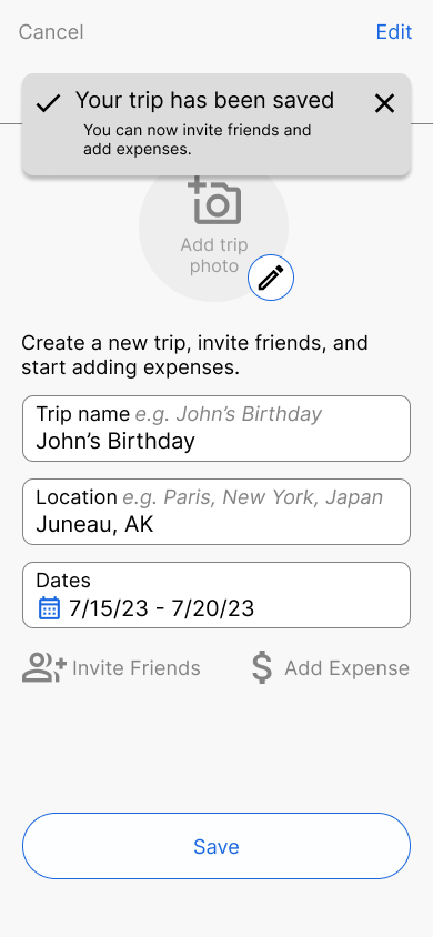
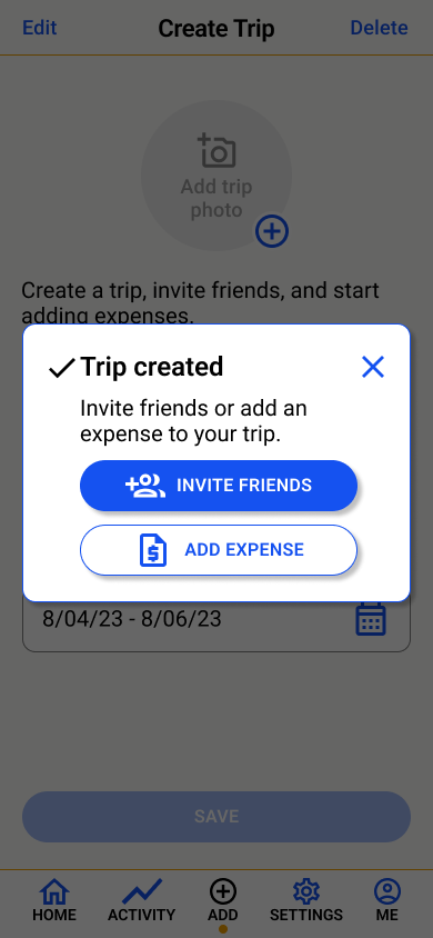
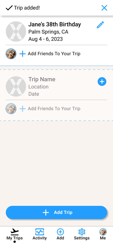
Modals: After adding a trip, the modal is a simple confirmation of the trip adding and navigates user back to homepage to see the trip that was added since users felt the modals were burdensome and wanted to see the added trip after clicking save.
after ‘Save’
Modal: After adding a trip, the modal is a simple confirmation that the trip was added since users felt the modals were burdensome.
Navigation: After saving trip, would automatically navigate back to ‘My Trips’ homepage where users can see the trip that was added.
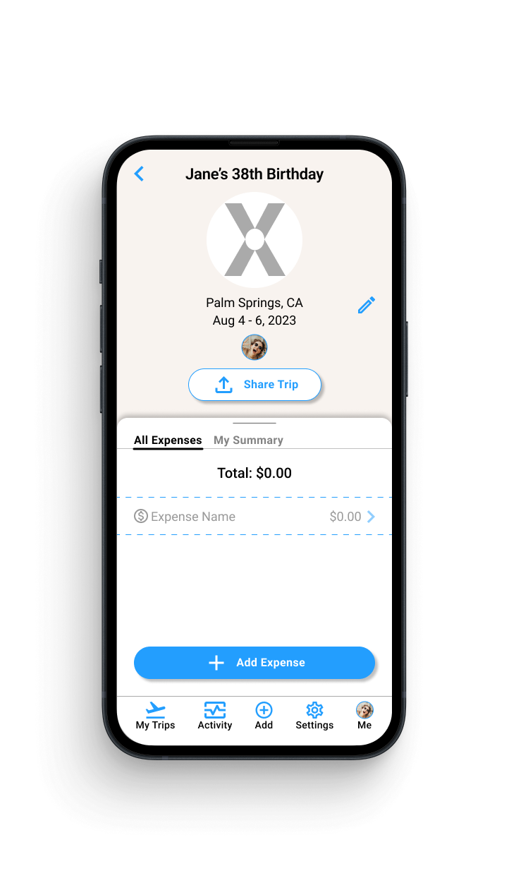
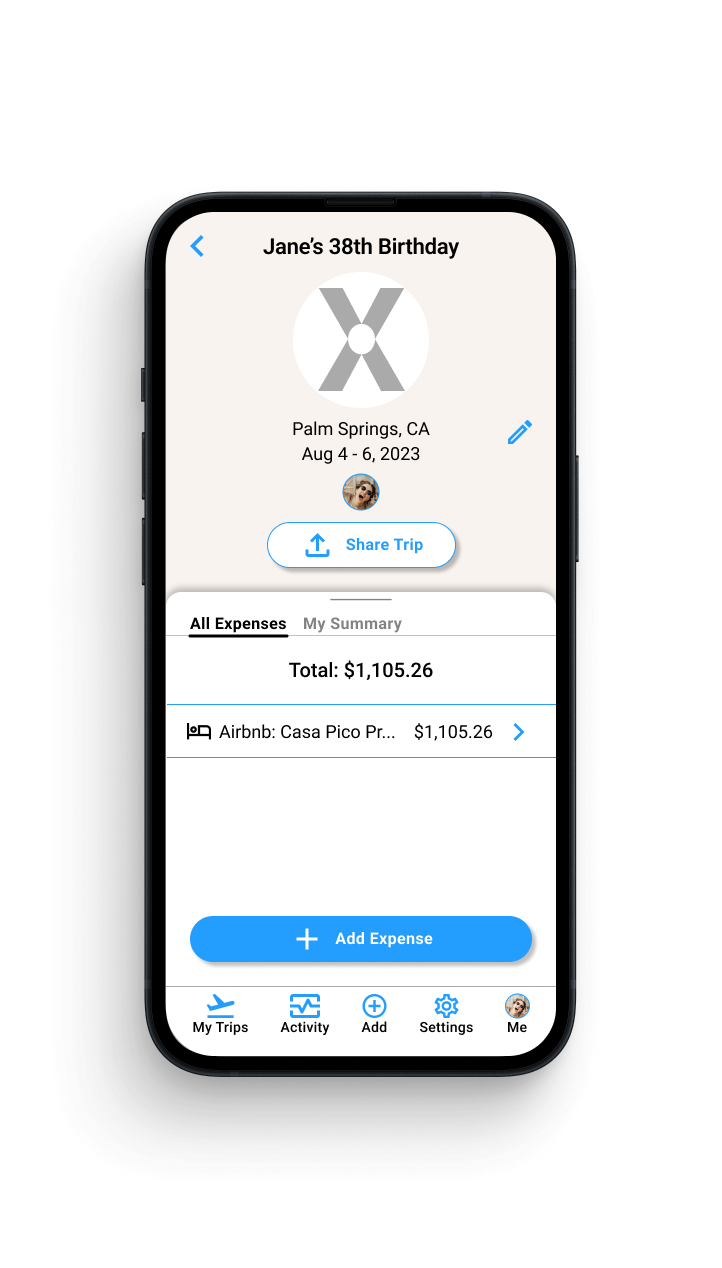
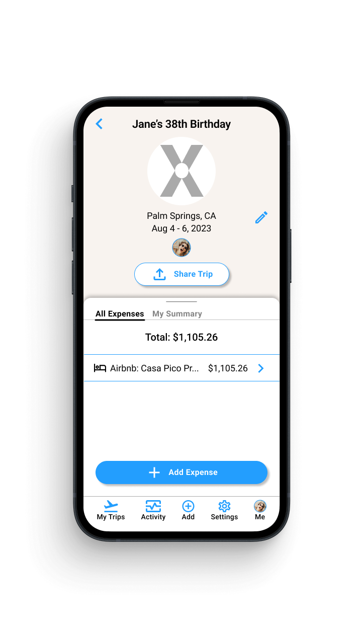
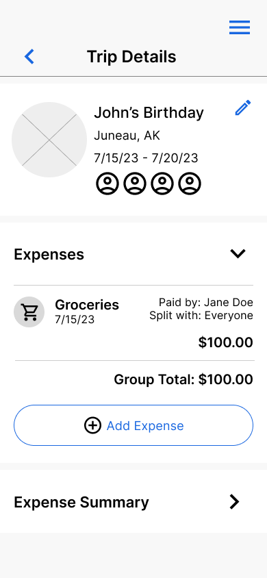
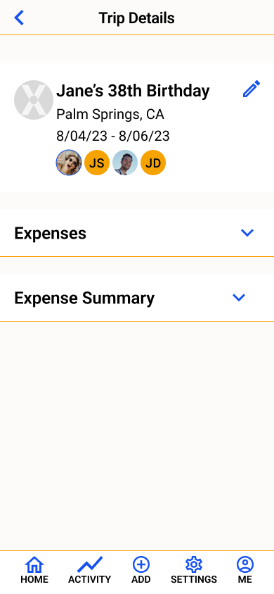
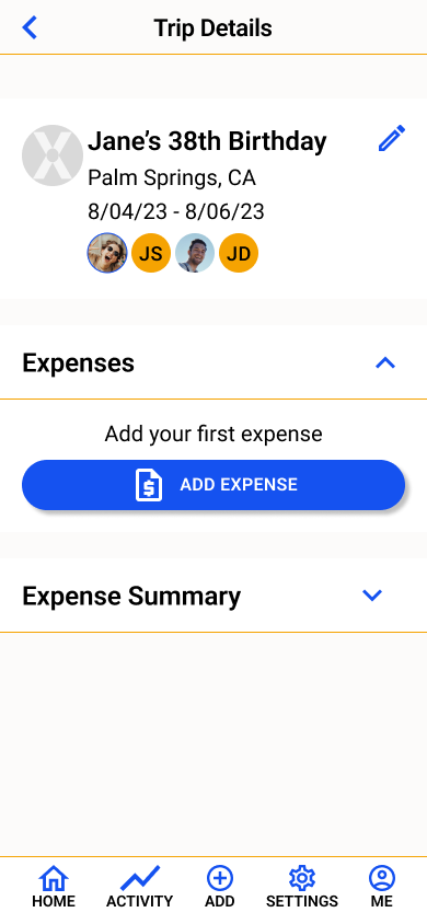
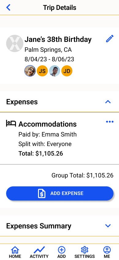
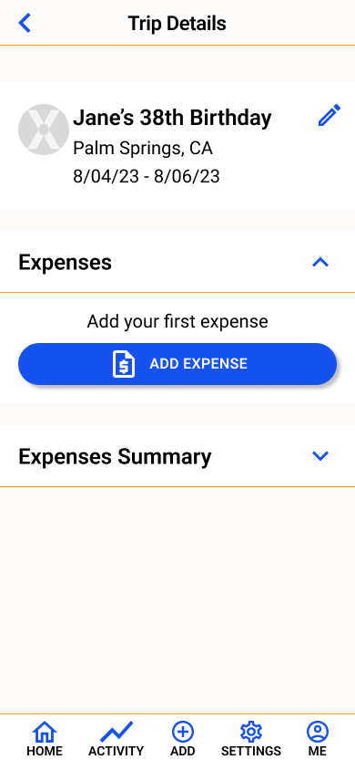
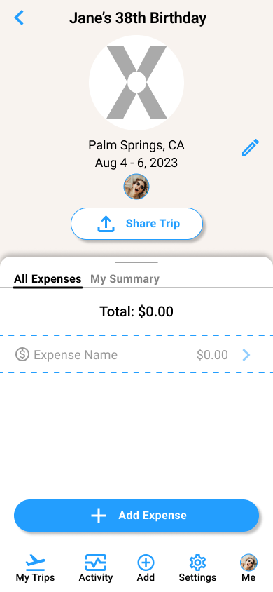
Trip Details Page
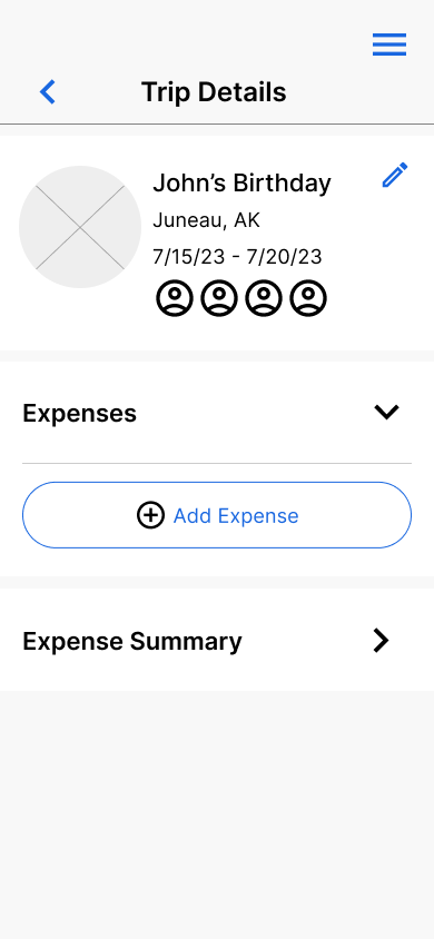
Layout: Changed the layout to be easier to navigate. Allows the users to use less clicks to see the information
Expense card: Condensed the card to show minimal information but gave each expense its’ own page where all details can live.
Expense division: Created a separation for all group expenses and personal expenses that could be easily accessed.
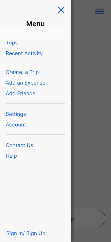
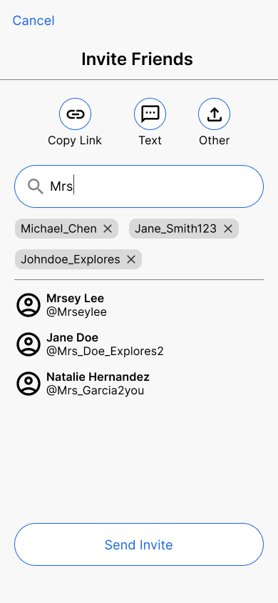
Adding friends to trip: Changed the method of sharing the trip to 1 option that would pull up the device’s native sharing options. Users said they would use this method even if they knew all trip friends were on the platform.
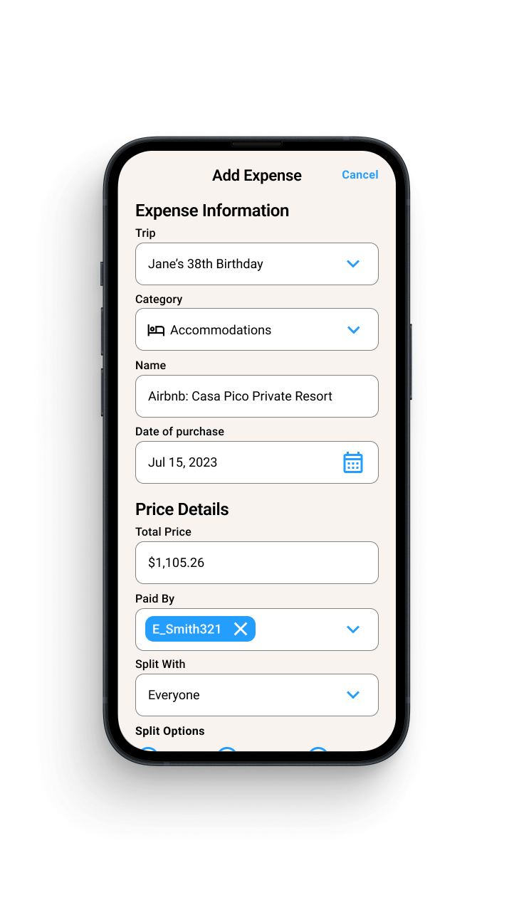
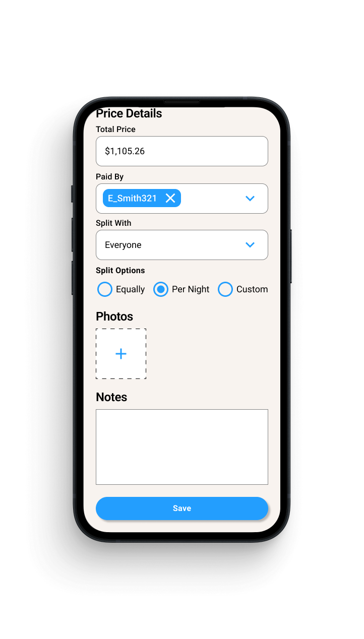
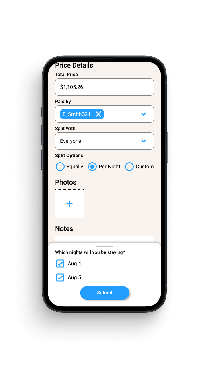
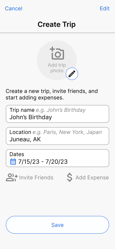
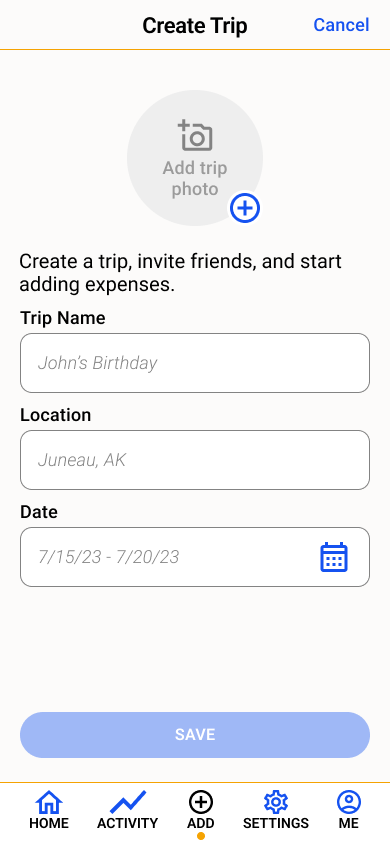
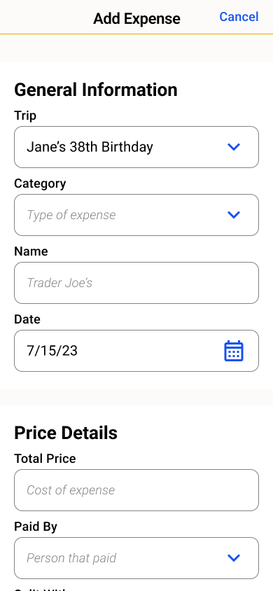
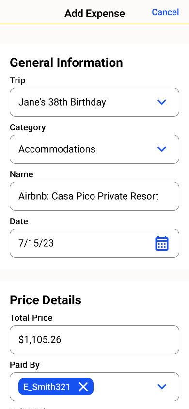
‘Add Expense’ page
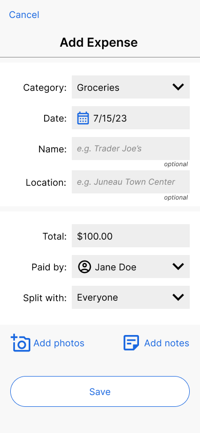
Layout: Got rid of background box to make this form consistent with ‘Add Trip’ form
Split options: Added split options since users wanted more complex splitting methods. Also added a drawer with options so users can customize the expense.
Photos + Notes: Added secondary tasks of adding photos and notes to the ‘Add Expense’ form for easy access and less clicks to navigate to them.
Expense card: Condensed the expense card to show minimal information but gave each expense its’ own page where all details can live.
Before
Before
Before
Before

After
After
After
After
Final Designs